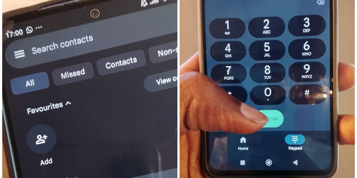
Why Your Phone’s Interface and Contacts Suddenly Look Different
Have you recently opened your phone and noticed that the dialer menu and overall interface look completely different? If so, don’t panic — your phone has not been hacked. What you’re seeing is the result of Google rolling out a big redesign of its Phone app, which has taken many users by surprise.
This redesign is part of Google’s ongoing move to its Material 3 Expressive (M3) design language, a visual style that brings both aesthetic and functional changes across the company’s apps. The new look is now live for most users running version 186 and above of the Phone app, and it will gradually reach more devices over time.
What Has Changed in the Phone App
At the core of the redesign is a cleaner, more modern interface. Google says its aim is to reduce clutter and make calling, browsing contacts, and checking your call history feel more straightforward.
One of the biggest changes is the merging of the “Favourites” and “Recents” tabs into a brand-new “Home” tab. In this new layout, your starred or favourite contacts now appear in a horizontal carousel at the top of the screen, while your call history flows neatly just below it.
Another noticeable shift is in the keypad design. Instead of being tucked away behind a floating button, the number pad now has its own dedicated middle tab. It also looks different, with a softer, rounded sheet-like style that matches Google’s new Material 3 look.
If you’ve been wondering where your full contact list disappeared to, don’t worry — it hasn’t been removed. Instead, Google has simply moved it. You can now find your contacts inside a navigation drawer, which you can access by tapping the search bar at the top. Alongside your contacts, this drawer also provides quick access to Settings, Clear call history, and Help & feedback.
A New Way to Answer Calls
Perhaps the most significant functional change is in how you answer or reject calls. Previously, Google relied on the swipe up or down gesture to pick up or decline a call. With the new design, this has been replaced by either a horizontal swipe or a single tap option.
According to Google, this new system is meant to reduce accidental responses — something that often happens when users pull their phones out of their pockets or bags and unintentionally swipe on the screen.
Voicemail and Other Subtle Tweaks
While voicemail hasn’t changed much in terms of features, its design has been slightly refreshed. It now appears in a list-style layout that feels more consistent with the rest of the new interface.
Google has also taken steps to unify the top-bar navigation across its apps, meaning the Phone app is now more in line with the design of other Google services.
Don’t Like the New Look? Here’s How to Undo It
As with most design updates, not everyone is happy with the changes. If you prefer the old layout, you can actually undo the update quite easily:
- Open the Google Play Store on your phone.
- Search for “Phone by Google”.
- Tap on the app listing, then tap the three-dot menu in the top right corner.
- Select “Uninstall updates” and confirm when prompted.
This will roll your Phone app back to its older version. However, keep in mind that Google is pushing these changes gradually through server-side rollouts.
That means even if you’ve updated to the latest version, you might not see the redesign immediately. Some users will get it sooner, while others will notice the changes later depending on their region, device type, and rollout phase.
Final Thoughts
The new Google Phone app may take some getting used to, especially with the rearranged tabs and relocated contacts.
But the redesign is part of Google’s bigger effort to make apps look cleaner, more consistent, and easier to use. If you like modern and minimal layouts, you may enjoy the update. If not, you can still roll back — at least for now.
Join Government Official WhatsApp Channel To Stay Updated On time
https://whatsapp.com/channel/0029VaWT5gSGufImU8R0DO30


